... a four-star hotel with the biggest water park in Estonia, a cosy spa and a trendy beauty centre, located in Pärnu in the immediate vicinity of a sandy beach. Delicious meals, amazing cocktails and beautiful views are waiting for you in different restaurants and bars. All guests are welcome to use a six-lane bowling hall, a perfectly equipped gym, a private and cosy snooker room, an aerobics hall, and a 25-metre swimming pool.
At Tervise Paradiis, we care about the better health and well-being of our guests during their vacation. We strive every day to ensure that every guest's vacation at Tervise Paradiis is worth the maximum rating. In order for us to understand each other as directly as possible, we have refined our communication to be as clear and simple as possible.
The client feels comfortable with us and knows that no matter what they came to Tervise Paradiis for, they have been waiting for them for a long time. We are ready for them because we care.
The rules for Tervise Paradiisi's visual identity are not complicated - they are handy tools. They can be used to design environments that are similar in nature and impression, as well as sustainable communication - no matter what campaign or channel it is.
No graphical system is ever completely ready, as no one can foresee all situations. If at some point you come across a question that cannot be answered on this page, ask for advice from the Tervise Paradiisi marketing department. There are no unsolvable situations. Reasonable dialogue and substantive analysis of existing tools consistently yield the best results.
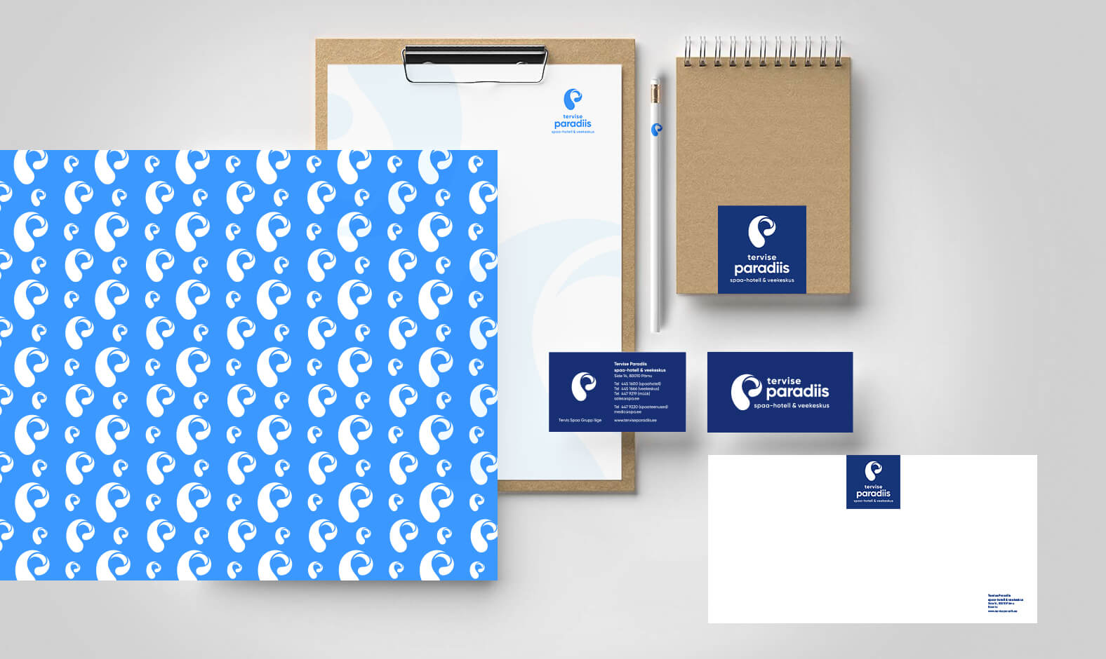
The logo of Tervise Paradiisi consists of a symbol and a text block. The logo symbol represents the movement of water in the shape of the letter 'P'. The logo symbol represents the movement of water in the shape of the letter p and visually conveys the qualities attributed to water, such as freshness, clarity, change, health, vitality, energy and plastic movement. This message is also supported by the use of corporate colors with white.
Logo symbol is the signature of Tervise Paradiis – the essence and beacon of the brand. The logo symbol represents the movement of water in the shape of the letter p and visually conveys the qualities attributed to water - freshness, clarity, change, health, vivacity, energy and plastic movement.
The logo and the lettering must be in proportion and positioned. The logo may also be used as a separate corporate identity in situations, but only in situations where the logo needs to be displayed on a particularly small surface. The logo may also be used separately as a decorative element in other cases (backgrounds, patterns, etc.).
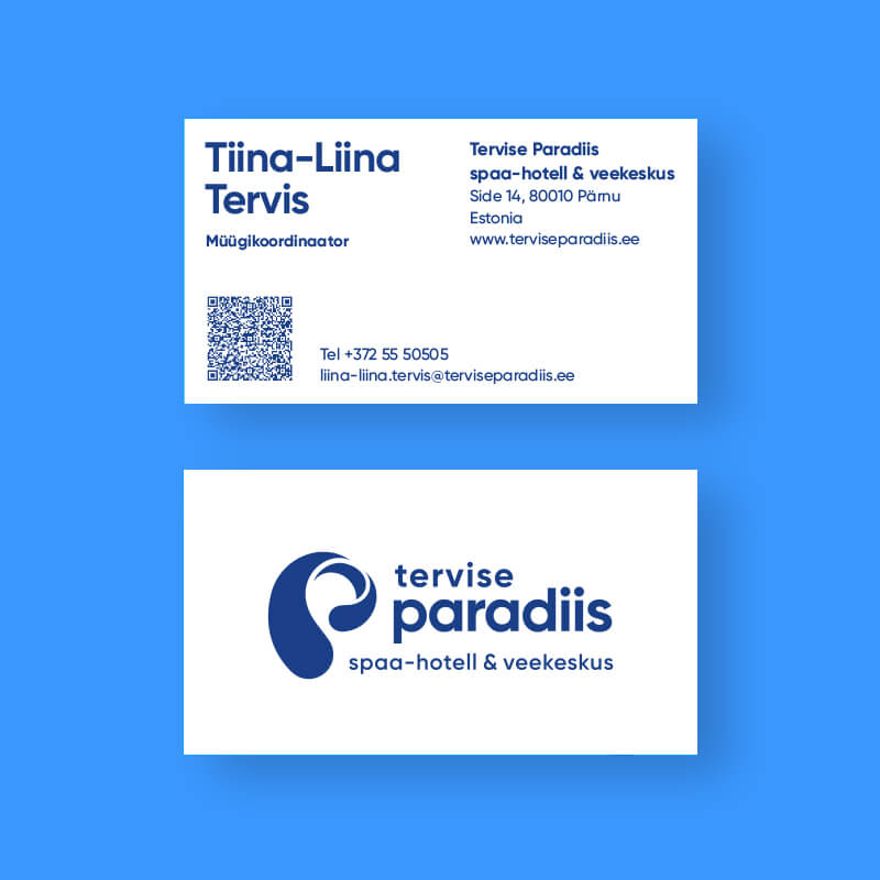
Text block consists of the name 'tervise paradiis' written in small letters on two lines and extension 'spaa-hotell & veekeskus' (or its translation) on a separate line below it.
In addition to Estonian, it is also permitted to use logos with a foreign language extension. Initially, there are 4 foreign language logos - English, Finnish, Swedish and Latvian.
If necessary, it is allowed to create additional logo solutions in other languages, in which case only the descriptive text will be translated into the foreign language (using the font of that language).
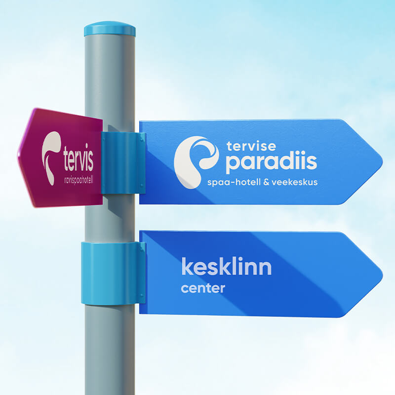
The Tervise Paradiisi logo is allowed in 2 placement solutions - horizontal and vertical. In the case of vertical placement, the sign is placed above the text block and they are aligned on a common central axis. In the case of horizontal placement, the sign is placed to the right of the text block.
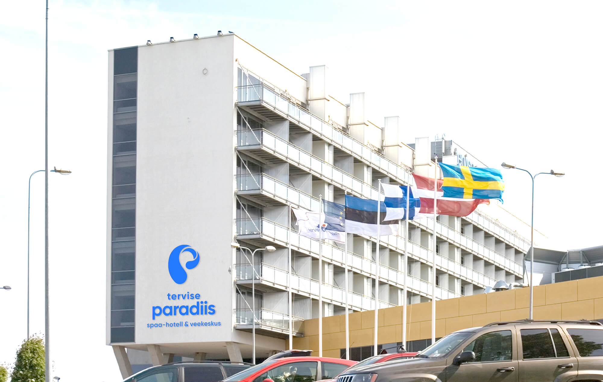
The minimum permitted size of the Tervise Paradiisi logo is determined by the height of the vertical logo and the width of the horizontal logo - 20 mm. If the logo is smaller than this size, the mark may be used separately. The minimum permitted height of the mark must not be less than 4 mm.
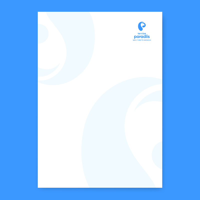
The 'breathing area' is the minimum free space surrounding the logo, within which no other graphic elements may be placed. The area protected by the logo on all four sides is the height of the letter 'p' in the word 'paradiis'.
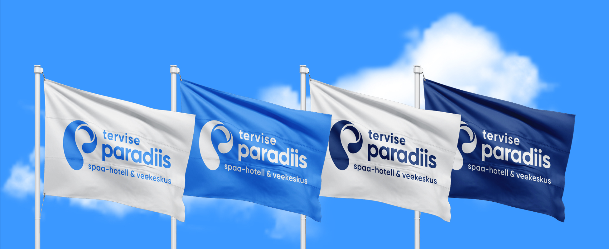
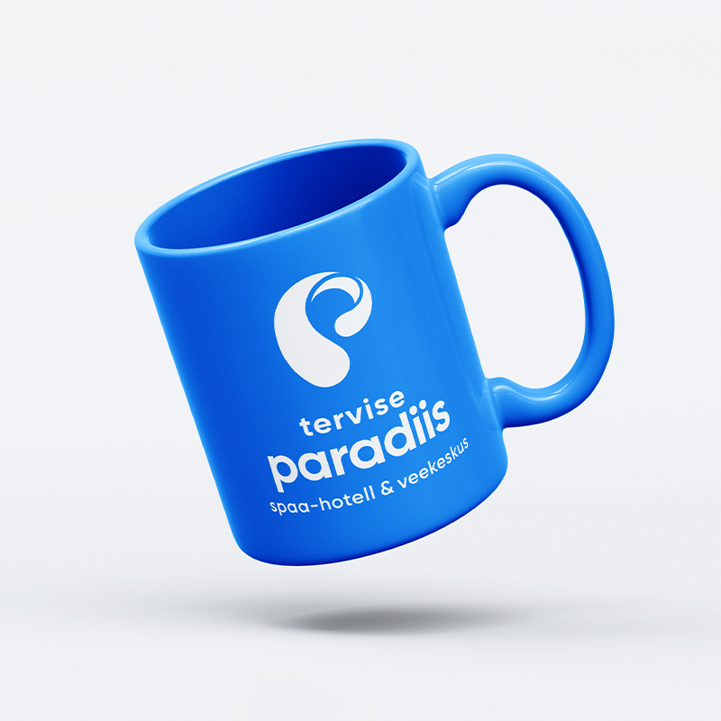
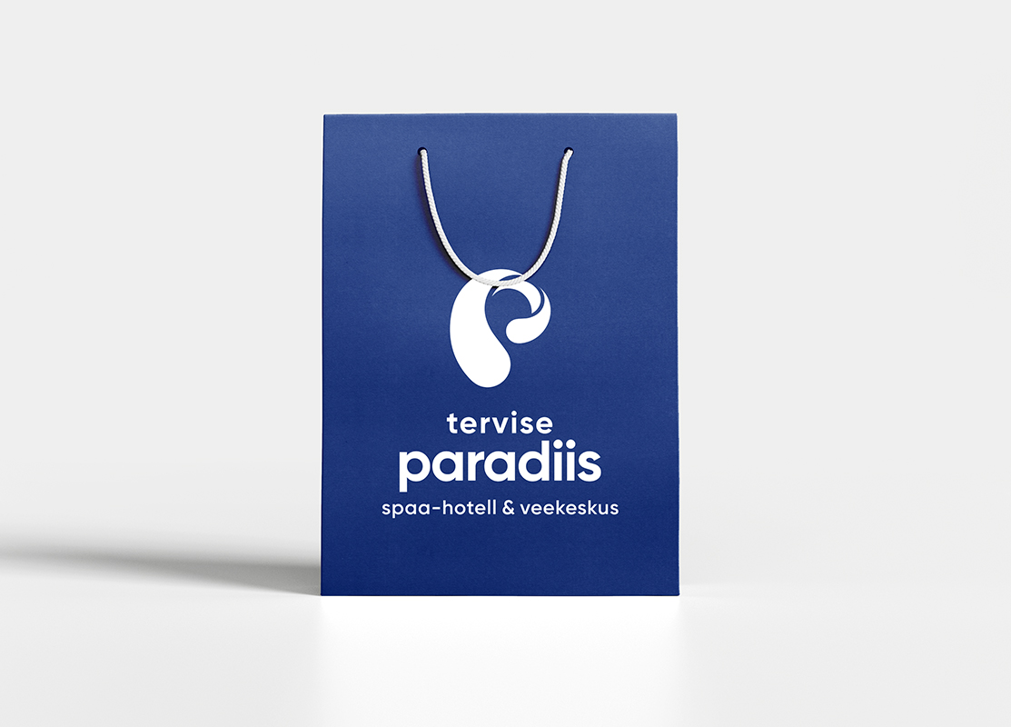
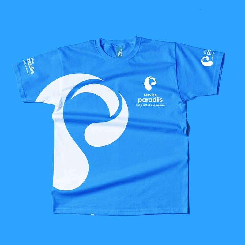
The corporate colors of Tervise Paradiisi are 2 - paradise blue and paradise midnight blue. The main companion of the primary colors is white, which emphasises contrast and clarity, or paradise sand yellow, which adds softness.
Tervise Paradiisi's corporate primary colors and accent colors can be used in additional surfaces or additional details (not directly in contact with the logo) in addition to the full color, also in 75, 50 and 25 per cent. The background of the logo must not be a percentage dilution of the same color palette.
!! Use low-contrast colors for the logo/background - white + sand yellow or white + blue!! Do not use ballet shades of the same primary color in the logo and background!!! Do not twist or bend<!! Do not rotate or tilt!! Do not stretch or compress!! Do not use on a colorful background without a background box!! Do not use a contour line!! Do not use a foreign color!! Do not add effects
The corporate font of Tervise Paradiisi is Gilroy. Three weights are used: Bold, SemiBold and Regular. Gilroy Bold with a continuous capital letter should always be used in titles. Gilroy SemiBold or Gilroy Regular is used for all other texts.
Download Gilroy fonts here https://font.download/font/gilroy-bold


If for some good reason you cannot use the Gilroy font, it is allowed to use the Poppins font as a substitute font.
Download Poppins fonts here https://fonts.google.com/specimen/Poppins


Visual examples of graphics.
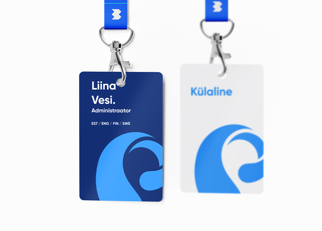
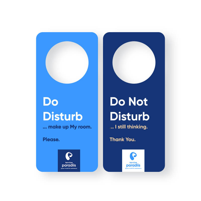
In media communication, a square-shaped solid area is ALWAYS used under the logo - preferably in a combination of midnight blue and white. A combination of blue/white CAN also be used, but the preferred solution is midnight blue and white. However, there is no preference as to which should be the background color and which the logo color.
In media communication, either a single image or a solid color area fills most or all of the background. Square 'boxes' are used to divide the surface of the top layers to distinguish or highlight different areas of the design - additional images, descriptive text, contact information. These surfaces can also be translucent. To separate the supporting additional image or larger text, a square area with a 10 degree (either +10 or -10 degrees) slope can be used at the bottom of the surface.
Only corporate colors or white may be used to fill surfaces.
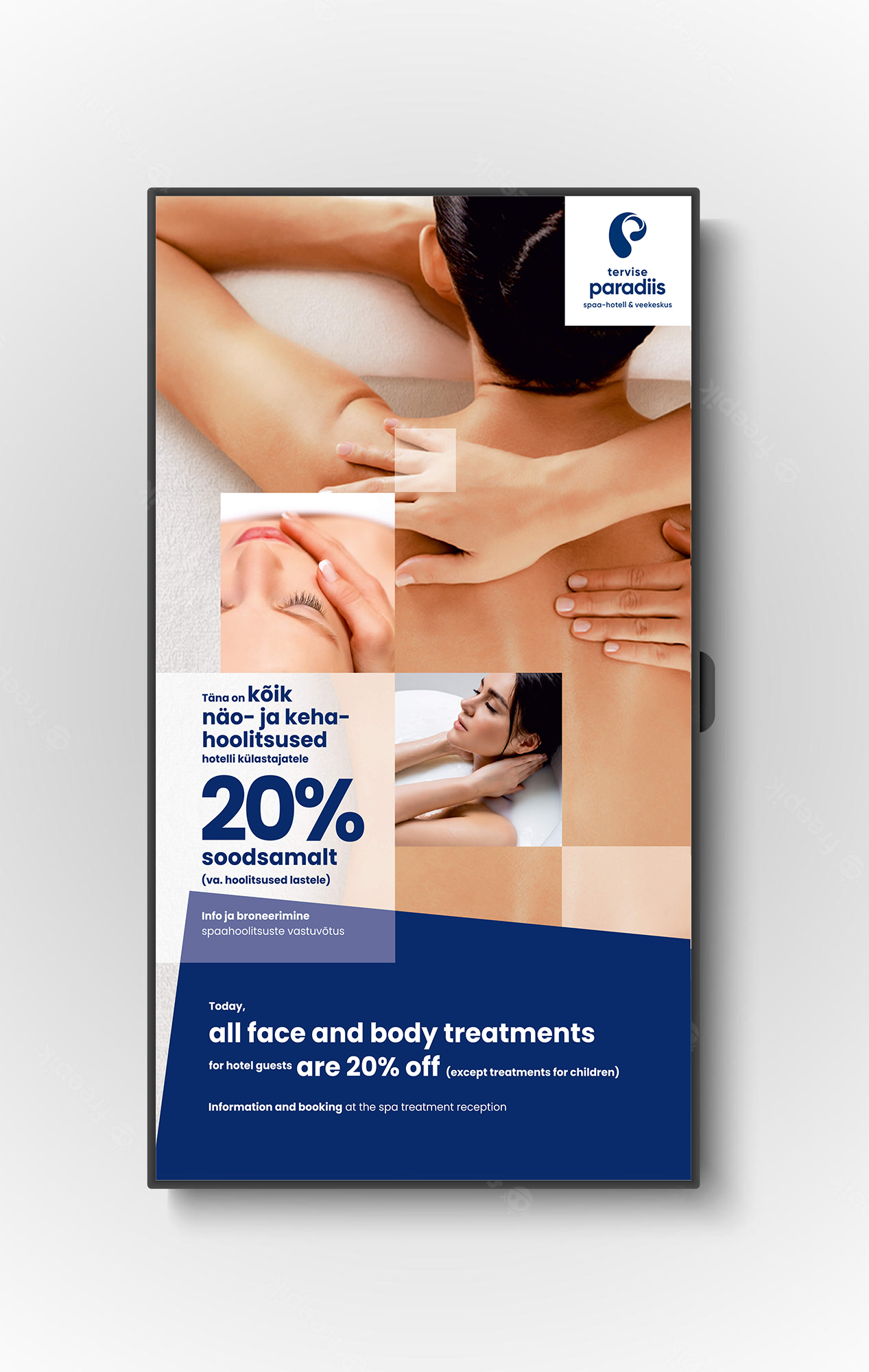
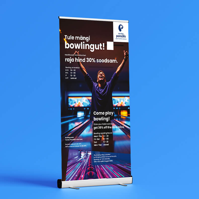
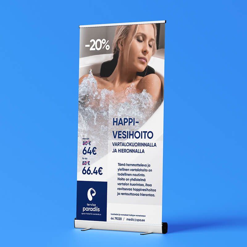
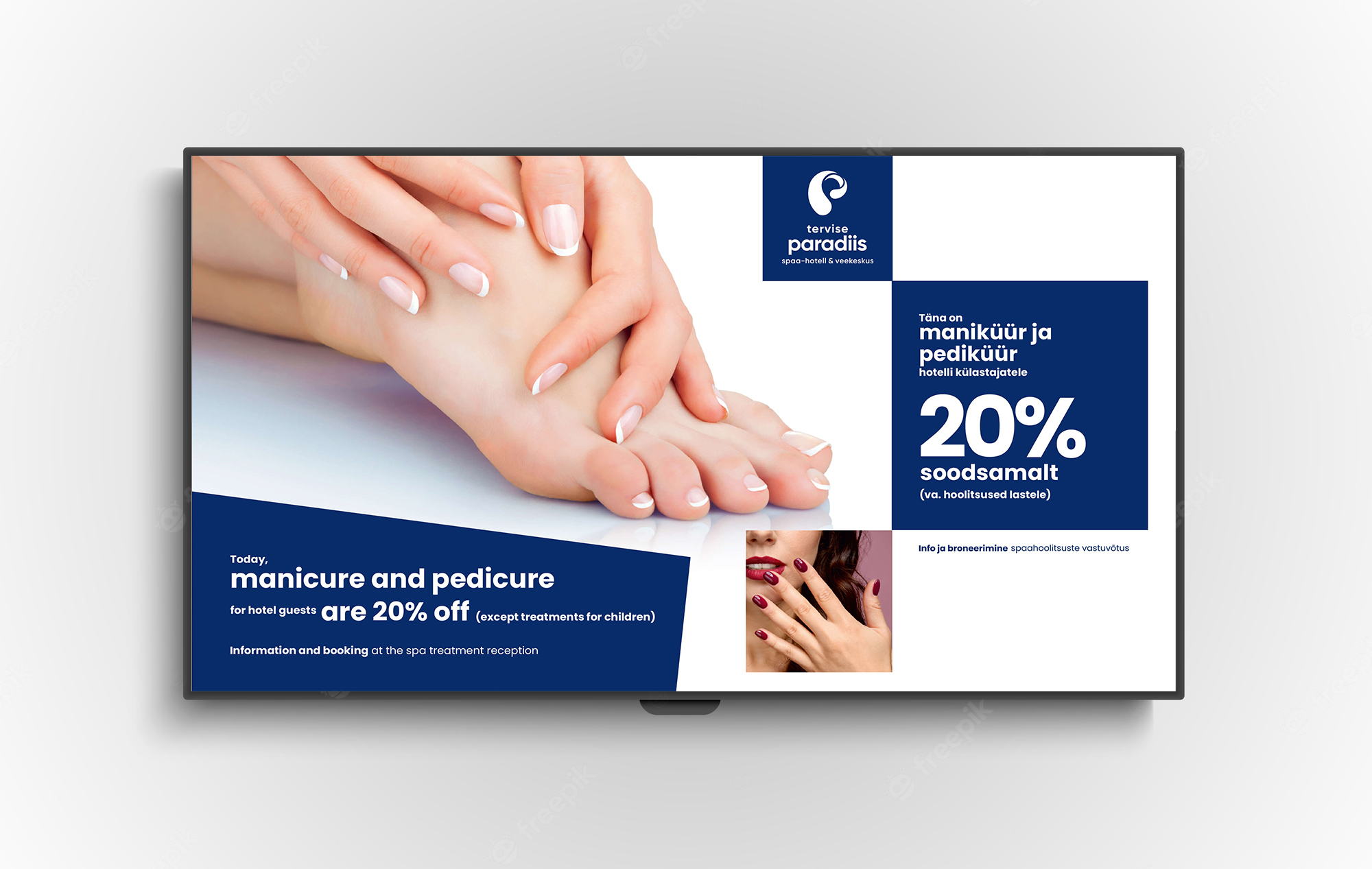
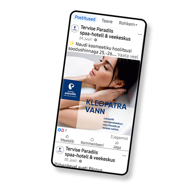
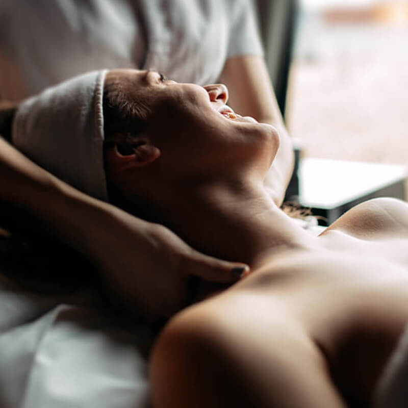
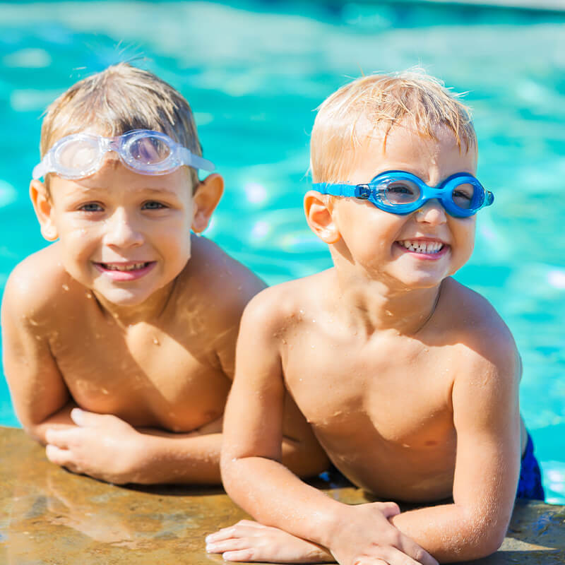
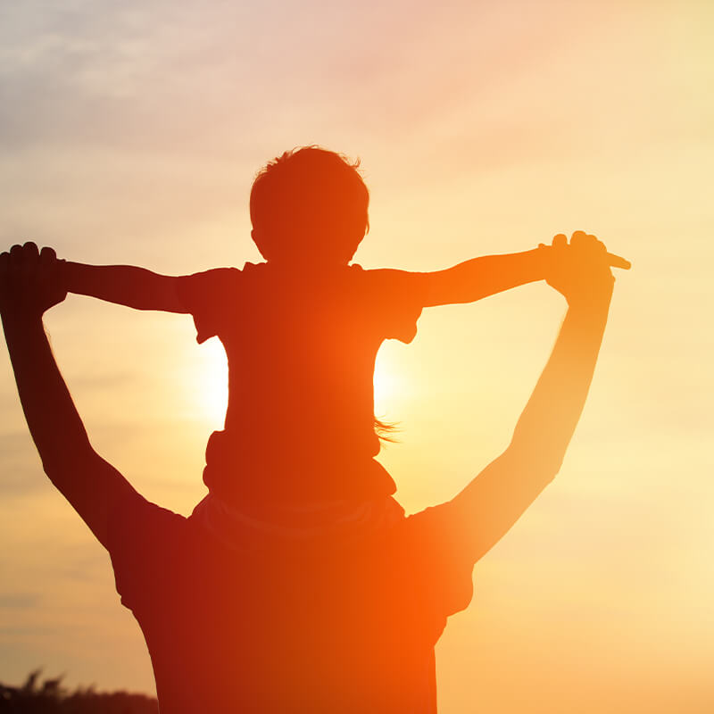
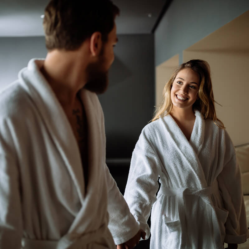
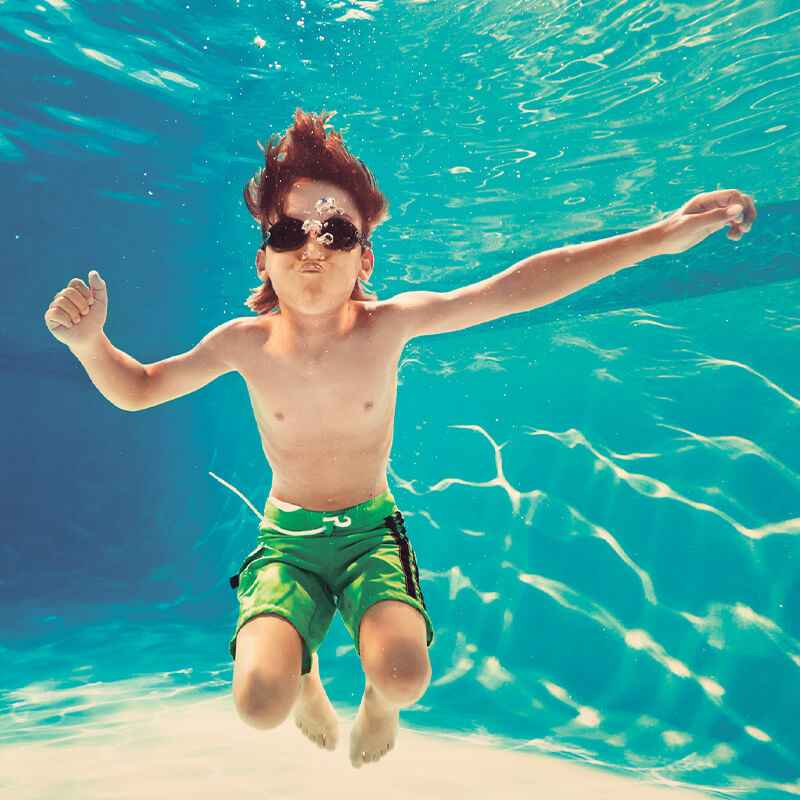
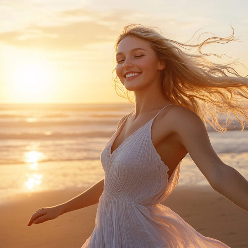
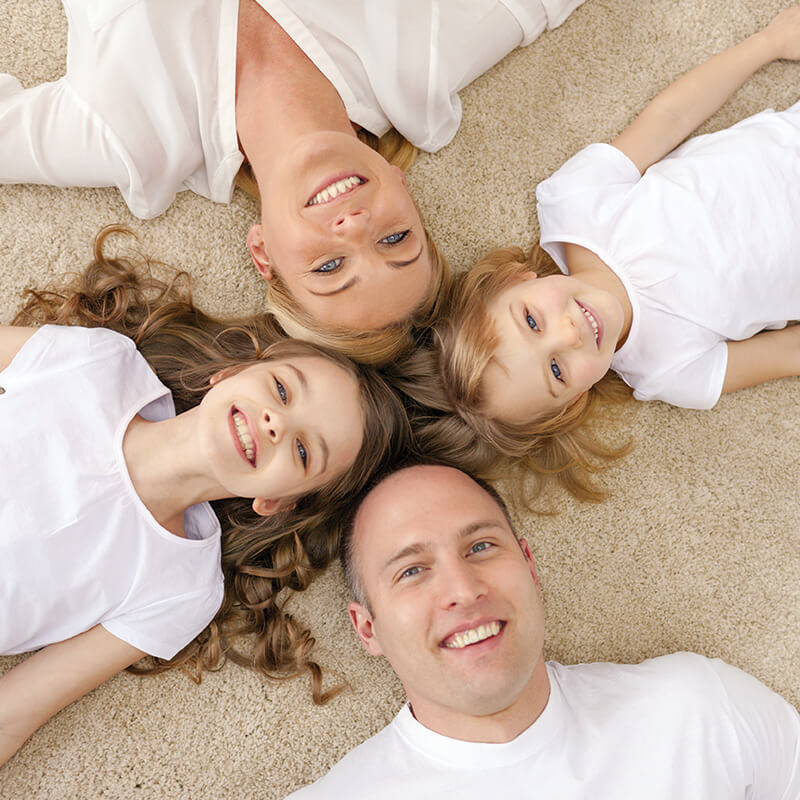
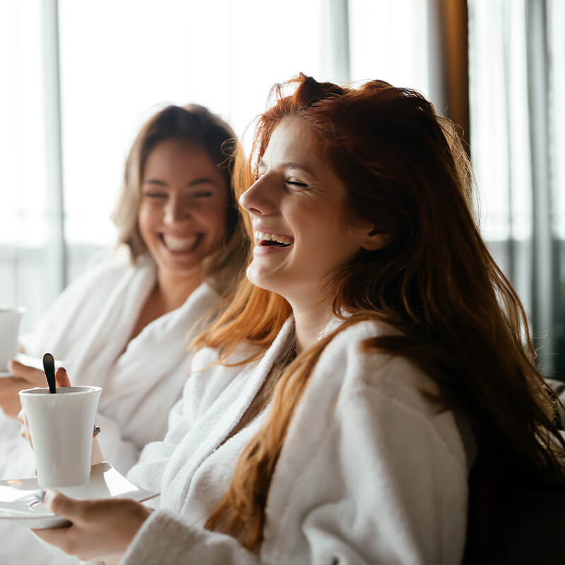
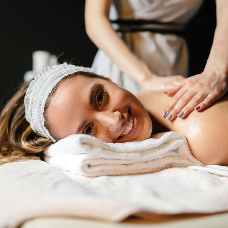
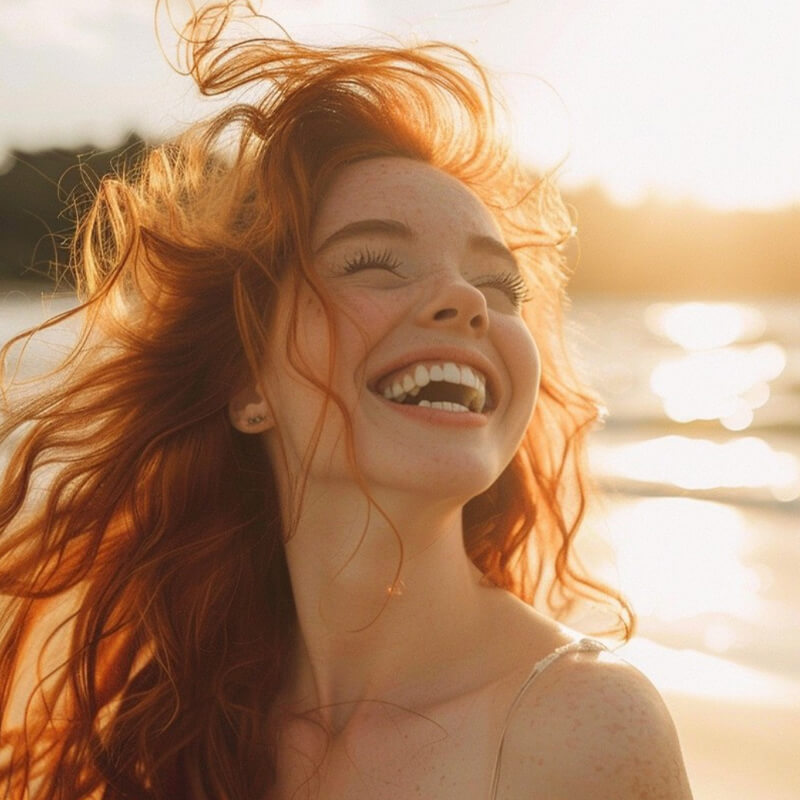
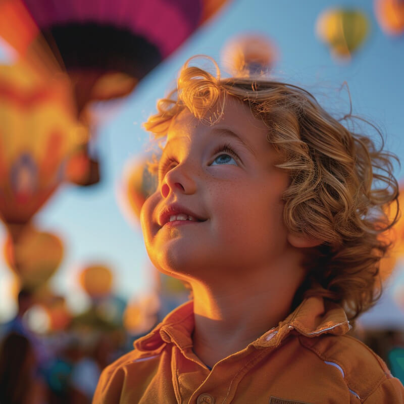
The visual language of Tervise Paradiisi's communication must always be associated with positive emotions - satisfaction, pleasure, happiness, love, gratitude. The images should be associated with beautiful moments, right choices and a positive environment. The visual language SHOULD NEVER BE aggressive, leave an arrogant impression or cause negative feelings such as fear or sadness. The color scheme of the images is rather clear and in strong tones.
People in the pictures should be on the younger side - children, teenagers, or young middle-aged adults.
From this section you can download logos PDF, JPG and PNG files, as well as both the Gilroy and Poppins font families.

